Kafi
Vietnamese coffee, given a brand worth pouring.
- Role
- Brand & creative direction
- Sector
- Coffee · FMCG
- Market
- Vietnam → global
- Deliverables
- Identity · packaging · cups
Kafi is a Vietnamese filter-coffee brand. The brief: take a local product with real character — origin, ritual, flavor — and translate it into a brand language that travels.
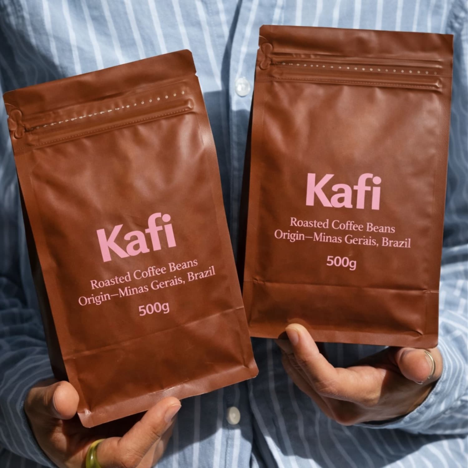
I worked on Kafi as a creative contribution to a Vietnamese coffee brand — connecting the product's origin and flavor to a visual identity and packaging system that could stand on a shelf anywhere.
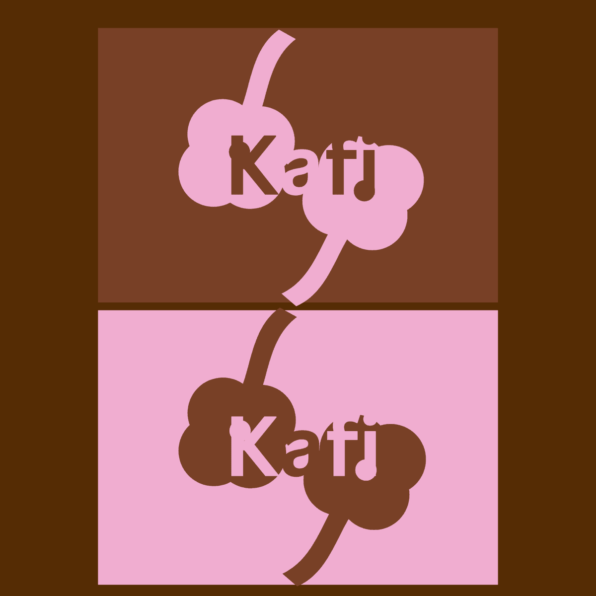
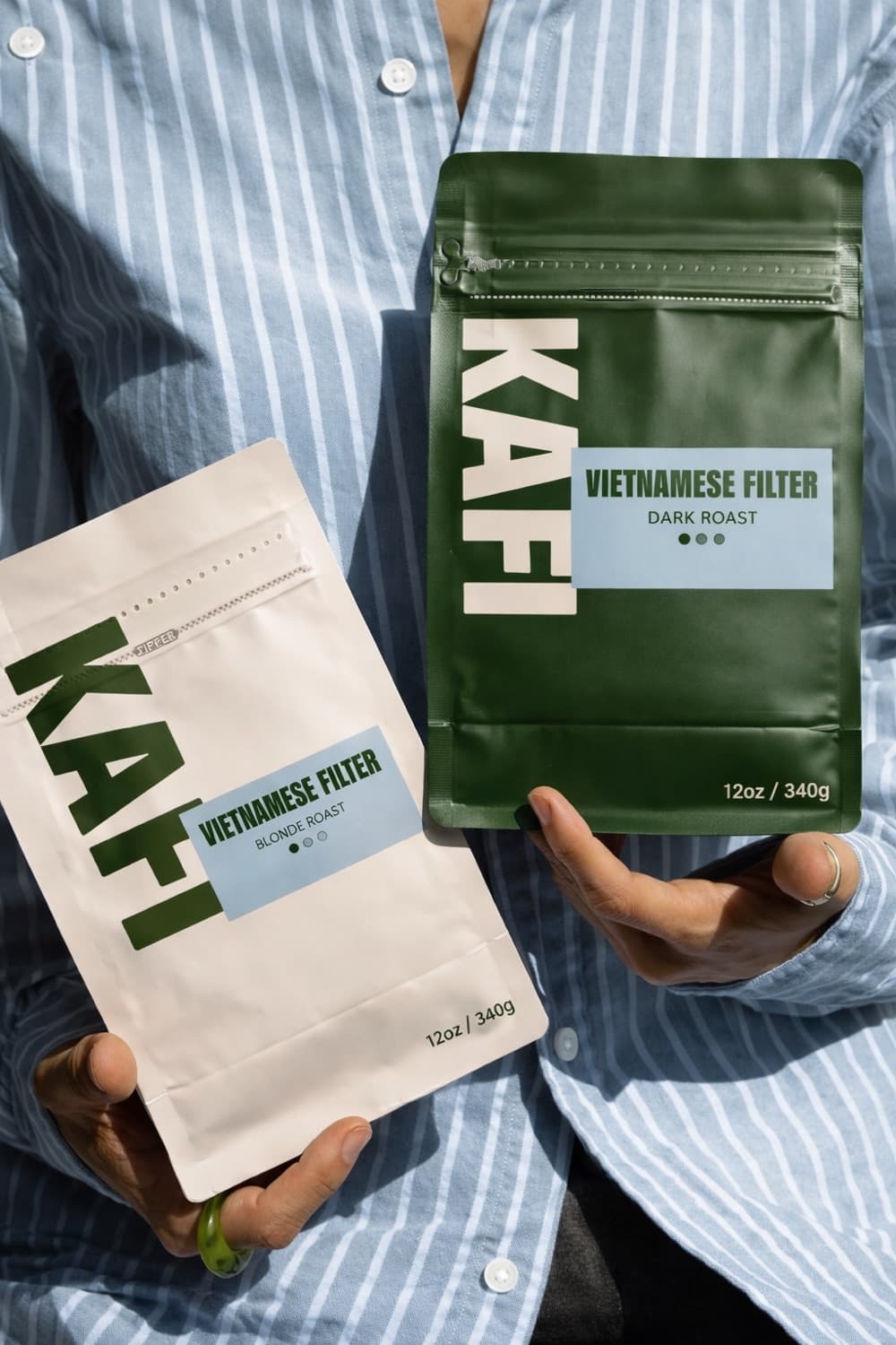
Rather than settling on one safe answer, the work explored two distinct directions: a bold, minimal 'Vietnamese Filter' system and a softer, playful 'cloud' mark — two personalities for the same cup.
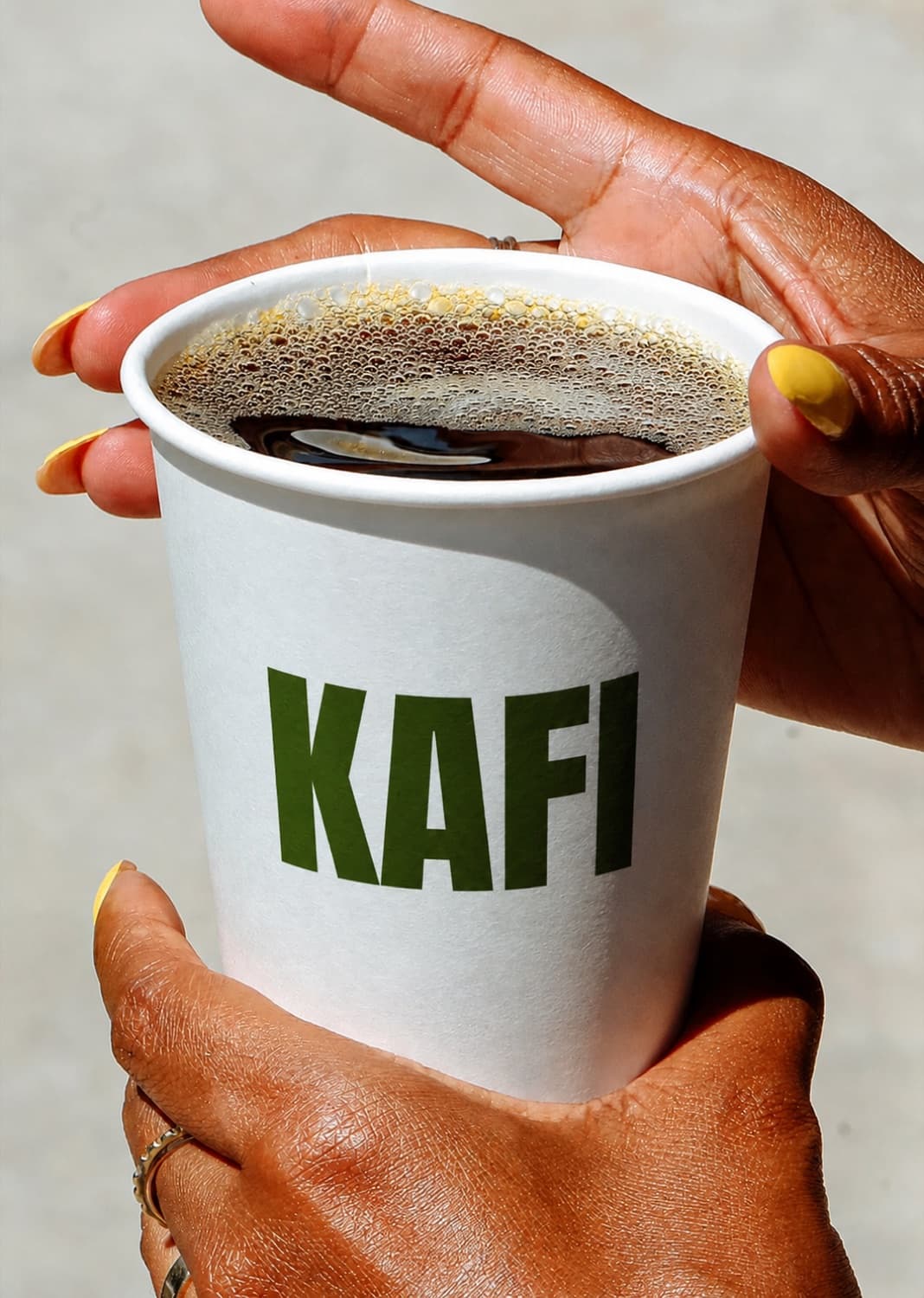
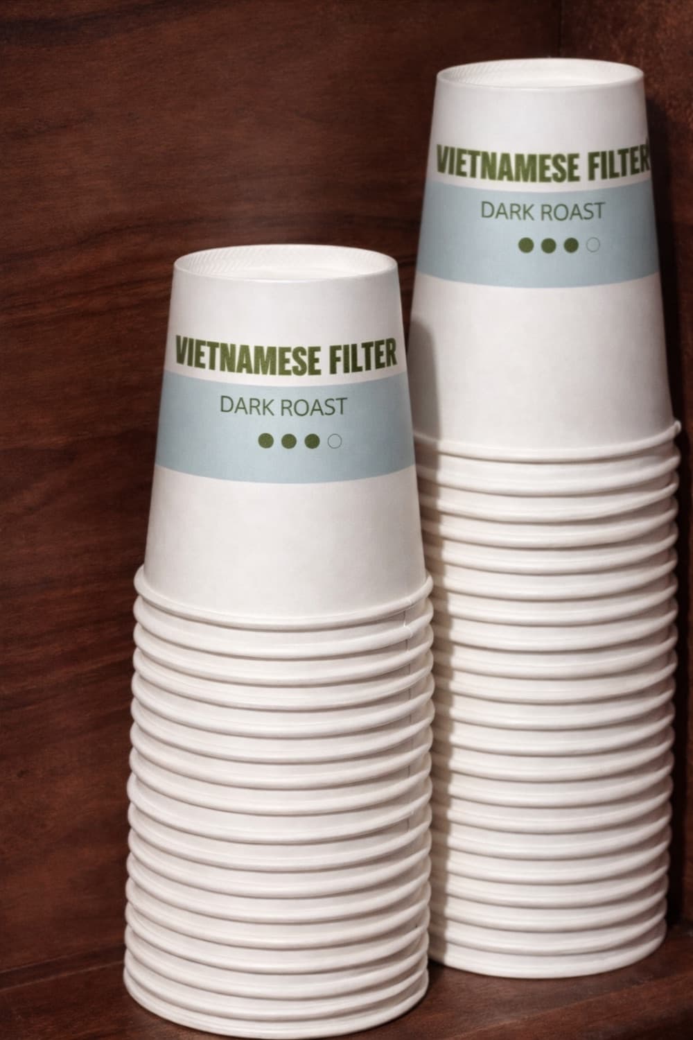
Vietnamese Filter
A confident, minimal system: a heavy green wordmark, roast-coded labels (blonde → dark) and a calm cream base. Built to read instantly on a bag or a to-go cup.
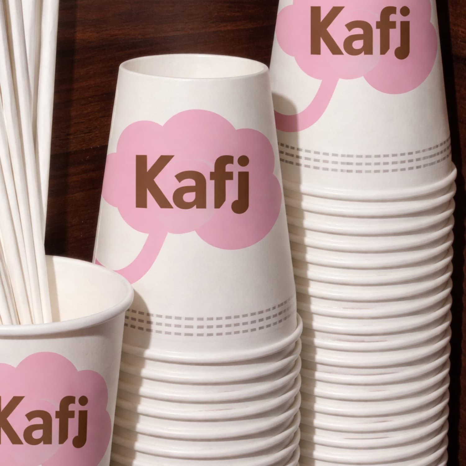
Cloud mark
A warmer, friendlier route: a pink-and-brown speech-bubble 'cloud' logo with a cherry-stem flourish — coffee as a small, daily moment of joy.